Dashboards
Overview of Peel's Dashboard functionality.
Peel pre-populates all the analysis you can ever wish for without you having to write a query or filter anything.
➡️ Peel places those in Metrics.
➡️ You can filter Metrics by segments, time frames, and visualize in different way -- when you save those views, they become Reports.
➡️ The Reports can be collected and organized in a view called a Dashboard.
Arrange multiple data visualizations together and review the segmented metrics you care about the most - all in one place.
Sample Dashboards
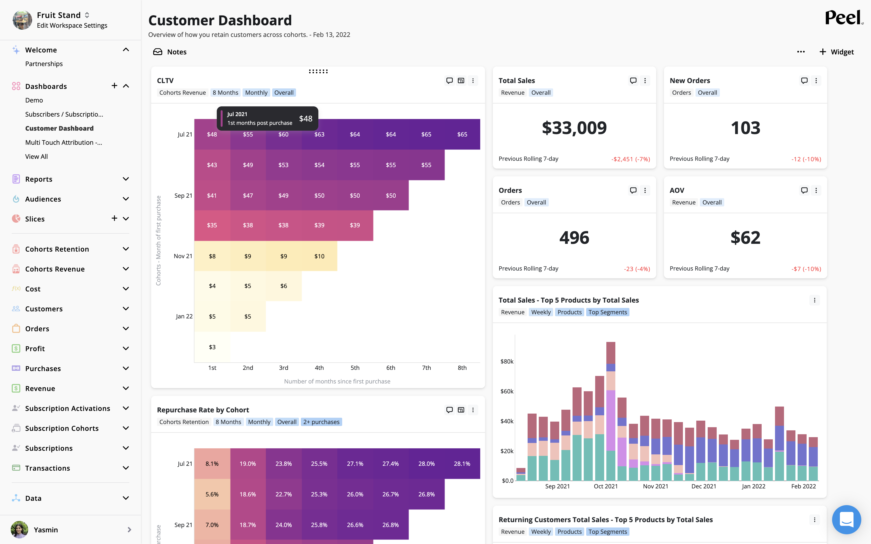
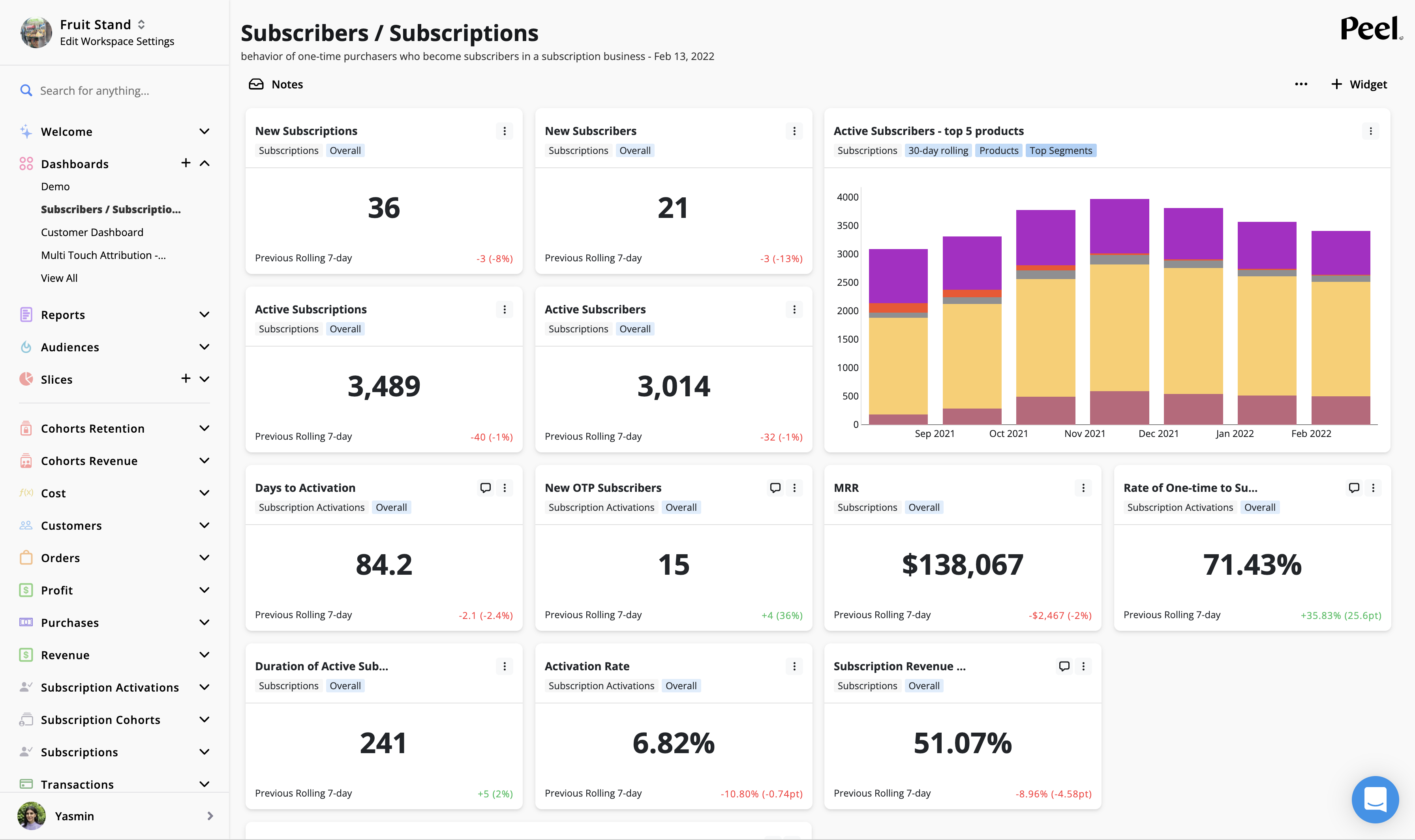
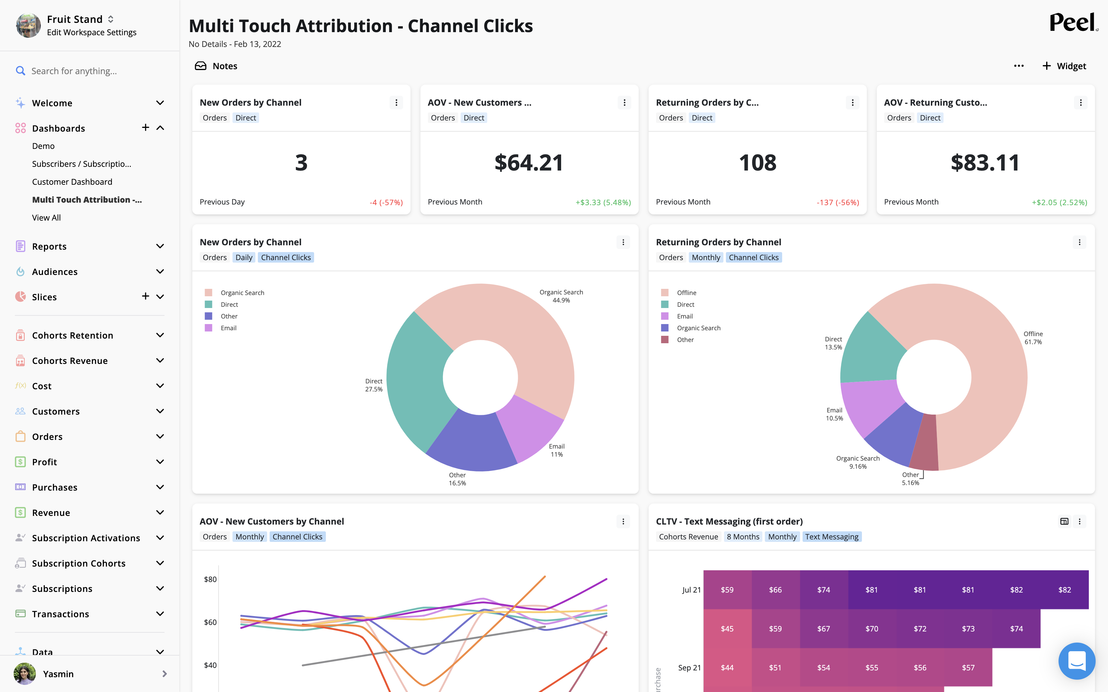
We prebuilt the Customer Dashboard, Subscriptions Dashboard, Marketing Dashboard, & Multitouch Attribution Dashboard and can add on to your account! Just ask!
You and your teams should add as many dashboards as you like depending on how you like to conceptualize your analysis.
We have seen teams organize dashboards into:
- Leadership Dashboards of metrics team want to go over in their weekly meetings to keep a pulse on business.
- Marketing Dashboards
- Attribution Dashboards
- Campaigns
- Product Launches
- One off projects
- Specific months -- ex: following April cohort because that is when we have our spring sale.

Customer dashboard template

Subscriptions dashboard template

Multi touch Attribution dashboard template
To create custom dashboards:
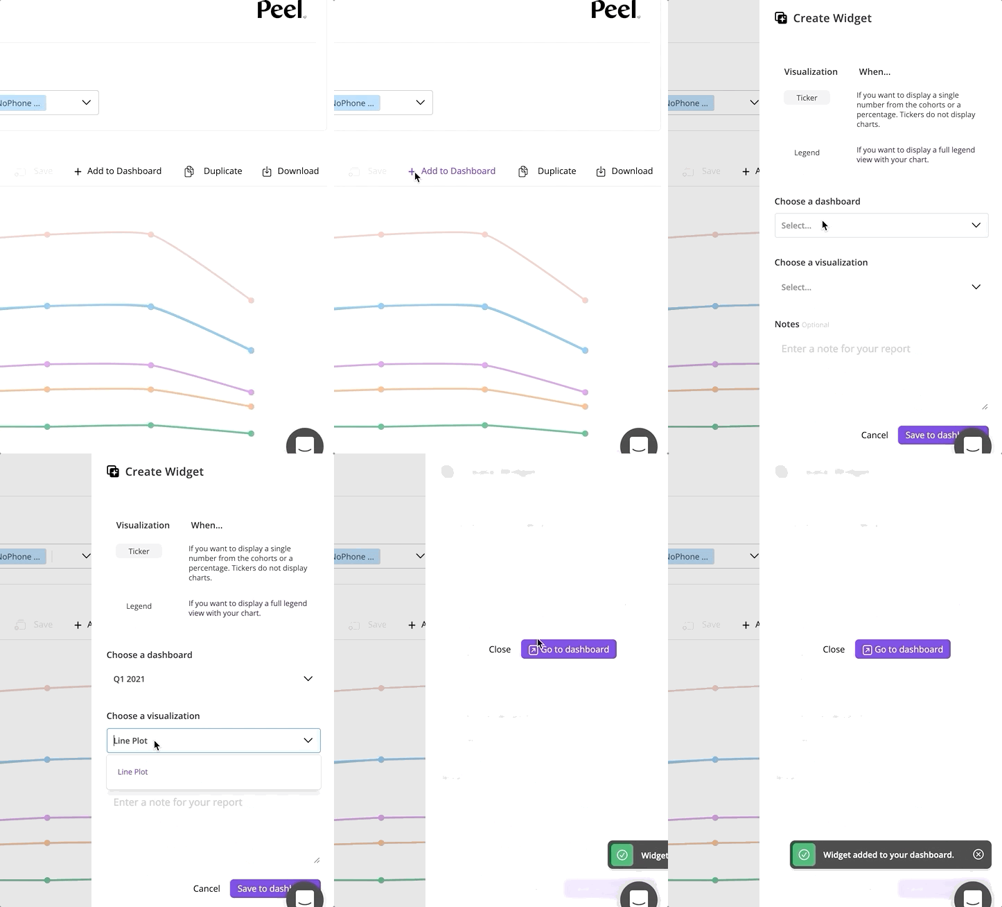
Now you can save those filtered views to revisit over and over again into a Report and add a series of those reports to a Dashboard.
1. Create Reports
Reports are saved views of the metrics that you are exploring. For example, if you are looking at Sales by Products as a way to keep your eye on inventory, you would go to the Sales metric, segment by Product, format the grouping of time periods and study. Now you can do this once, Save, name the report, and add to your Dashboard.
2. Create Widgets
A Widget is a visualization of a Report for a dashboard. They are either single numbers, called Tickers or they are graphs, called Legends. Here are examples of how the Tickers would look like for our Sales by Products Report.

3. Select Dashboard Options
With Peel, choose from a wide variety of metrics to create and customize dashboards. Dashboards are dynamic. As the underlying data changes, the dashboards automatically update so they are always relevant. Create it once, and keep your eye on it so you can make informed data-driven decisions.
- Add a Title, Description, and Notes to share context.
- Give your reports and widgets the context they need by adding elements notes.
- Organize your dashboard to tell your story.
- Rearrange your widgets to get your favorite layout, and add or delete at any time.
- Choose line charts, cohort tables, cohort curves, pacing graphs, and number tracker types to create the best visualization of your data.
- Share the link with your teammates.
- Find it in the left nav with all your other Dashboards, Reports, Metrics.
- Bookmark it to always revisit.
Peel is a no-code product automated analysis tool that lets you create powerful reports and dashboards from Peel’s precomputed web view data. Explore the analyses, save them as Reports and add them to Dashboards to always keep coming back to and share with your team.
You can create a read only dashboard to share out to external users as well. Just click the purple share button!
In this section
Updated 11 months ago